We offer a wide range of services for that renovation, update, or regular maintenance to keep your home functioning and safe. We also offer financing options for those larger projects.

Painting / December 22, 2021

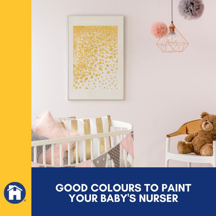
Elements of colour can help your young one’s development while creating an ambiance of calm and rest. Whether you’re expecting or you just want to freshen up your nursery for your growing baby, certain paint colours suit nurseries better than others. Learn more about which colours will complement your style and your baby’s development and who to call for painting services in Saskatoon.
As you design or update your nursery, remember that babies are developing their field of vision from birth on. To hit milestones, visual stimulation is integral to development.
From birth to about four months old, babies can see a black and white spectrum mix. Consider distance, too; depth perception and field of vision are still growing at this age. If you are opposed to a monochrome room, you can get a mobile to hang above the baby’s crib, primarily black and white.
Your baby is beginning to differentiate between colours at this stage, and you may even notice that the baby has a preference for specific colours. Bright, primary colours that are easy to contrast are ideal for a baby’s development at this age.
At this age, a baby is beginning to make more colour connections. As you introduce a more comprehensive range of colours, this may be the time to update your nursery paint from the initial bringing home of the baby. Baby’s colour vision at a year and on is well-developed and continues to sharpen.
Choosing a paint colour for a baby’s nursery can be daunting, just like choosing a paint colour for your bedroom. Keep in mind that you want to extend the style of the home into the nursery but also create a unique space for your baby to learn and grow.
Orange is warm, modern, and hip. Many parents choose orange as an extension of the style in their home. However, choose wisely; too much can be overstimulating to you and your baby. Orange may be best left to an accent colour that a baby can appreciate for contrast.
While purple retains undertones of both primary colours that it encompasses, red and blue, it can be used as a deep accent or as a pastel wall colour. Purple is calming and rich but can be overwhelming and agitating if too much red is involved in the mix.
Yellow is an excellent primary colour that can be used in varying tones and levels of brightness. Babies will generally love it because it is a primary colour and contrasts nicely with other colours. Yellow is also considered a cheerful and energizing colour but can be overwhelming to some, so be sure to re-evaluate at the one-year mark to see if you and your baby are ready for a change.
Gray is a fantastic fail-safe for painting a nursery. When deciding which path to go down before the baby comes home from the hospital, just go with a light to medium gray and say goodbye to much of your stress and support the baby’s colour development along the way. Gray is calming and works on a monochrome palette to support visual development.
Depending on your baby’s age, you can choose accents based on their location on the colour wheel. Painting professionals at Handyman Connection will help guide you to which colours compliment and contrast each other. Since baby’s eyes are developing and need stimulation, contrasting accents provide a great visual workout without overwhelming the room or your style.
The professionals at Handyman Connection in Saskatoon provide high-quality services and excellent customer support. As you plan for significant changes in the nursery, be sure to contact Handyman Connection to take the stress out of planning and painting.