Handyman Connection is a Great Fit for You! Visit our Career Page! Click Learn More.

Home Remodeling / January 9, 2024

When considering a living-in-place remodel for your home, one of the critical factors is to ensure not just a safe, functional environment but also an emotionally comforting and visually appealing one. For older members of the household, properly selected colors can significantly impact mood and mental well-being, making the choice of color scheme a matter worth careful consideration. Handyman Connection® of Mason shares more insight.
The palette of your home can influence relaxation, stimulation, and even appetite, so it’s crucial to pick colors that encapsulate the desired atmosphere. Aging eyes perceive colors differently, and certain shades can become challenging to distinguish. Thus, choosing the right color combinations can minimize this issue, fostering both comfort and safety within the living space.
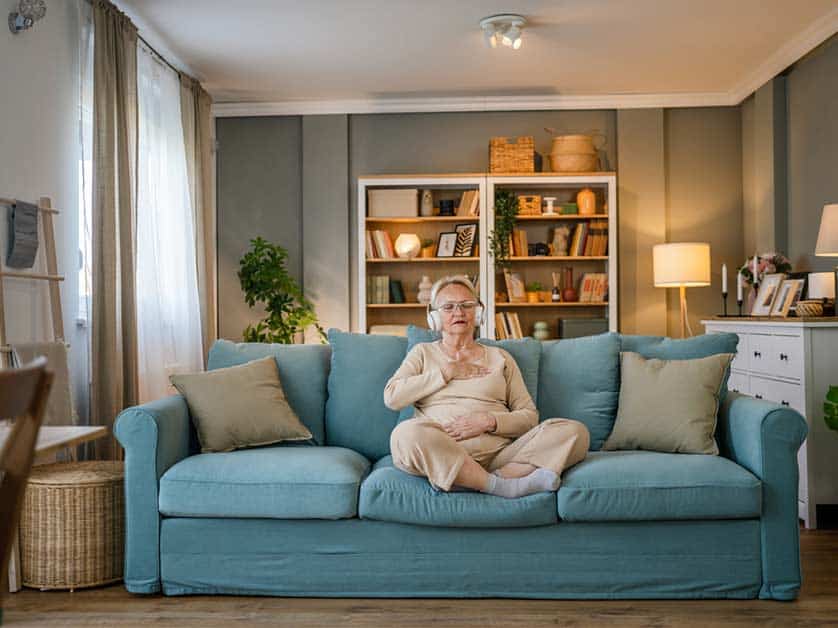
The 2024 color trends for senior living are leaning towards earthy tones, such as Brandy Brown, which evoke feelings of strength, resilience, security, and safety. In tandem with Brandy Brown, pale blues, greens, and muted shades create a soothing backdrop for residents. Such colors are not only aesthetically pleasing but also timeless, connecting residents with comforting memories while ensuring a modern and inviting living space.
It’s important to look beyond the walls when integrating color into a living-in-place remodel. The existing hues of furniture, draperies, and other room accents are integral to a harmonious design. Cool and soft colors pair well, promoting a calm atmosphere, which is essential in areas designated for relaxation. Similarly, the placement of furniture should facilitate easy navigation, making the living area not only safe but also psychologically comforting.
Color contrast can greatly benefit the navigability of the living area, particularly for those whose vision may not be as sharp as it once was. Shades that stand out against one another help distinguish different spaces and furniture pieces. In addition to contrasts, safety features such as added railings or converting stairs into ramps can greatly increase the practicality of your home while maintaining aesthetic appeal.
When dealing with memory care, colors take on an even greater significance. Dark shades might be interpreted as voids or obstructions, so they should be used strategically. Aim for muted colors and avoid high-contrast patterns that can confuse and disorient. This care in color selection creates a supportive environment that can alleviate stress and enhance comfort.
In concert with color choices, lighting in a living space strongly influences the way colors are perceived, especially in the eyes of older individuals. Effective use of lighting can compensate for color perception changes, ensuring the environment remains clear and visually accessible. Natural light, complemented by well-placed artificial sources, can make all the difference in enhancing the vibrancy and warmth of your chosen colors in your Blue Ash residence.
For professional assistance and guidance on your next remodel project, reach out to Handyman Connection of Mason for expertise in creating a harmonious and secure living space. You can contact us at (513) 733-3777 to get started. You can also reach us online for a free estimate!