We are excited to announce that a long time Master Craftsman of our business is now the proud new owner; please join us in congratulating Earl Swader as the new owner of Handyman Connection of Blue Ash. Earl has previous business ownership already under his belt and is looking forward to continuing to serve the Blue Ash community as the proud owner.

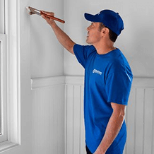
Painting / May 14, 2025
When it comes to brightening up any room in your home, neutral paint colors are often the best choice. Unlike bold or dark hues that can sometimes make a space feel smaller or more enclosed, neutrals have a unique ability to reflect natural and artificial light, instantly making a room feel more open, airy, and inviting. Whether you’re refreshing a bathroom, dining room, or living area, neutral tones create a clean, calm backdrop that enhances the brightness and overall ambiance of the space.
According to interior designers from Boca Raton, FL, one of the key reasons neutral colors work so well to brighten rooms is their versatility. Shades like soft whites, warm beiges, gentle grays, and muted taupes don’t compete with your furnishings or décor; instead, they complement and amplify the existing elements in the room.
Neutral colors also contribute to a sense of tranquility and balance. In spaces like bathrooms and dining rooms, where relaxation and comfort are key, these tones help create a serene environment that encourages calmness and connection. By choosing the right neutral shade, you can brighten a room without overwhelming it, striking the perfect harmony between light, warmth, and style. This makes neutral paint colors the ideal foundation for any room you want to refresh and illuminate.
The following neutrals offer a range of warm and cool tones, making them ideal choices to brighten bathrooms, dining rooms, living areas, and beyond.
Benjamin Moore White Dove is a beautifully soft and warm white paint color that has become a favorite among designers and homeowners alike. Its subtle gray undertones give it a gentle depth, preventing it from feeling too stark or clinical, while still maintaining a bright and airy quality. This balance makes White Dove incredibly versatile — it works well in a variety of spaces, from cozy bathrooms to elegant dining rooms and spacious living areas. The warmth in the color adds a welcoming and inviting atmosphere, while its light-reflecting properties help to enhance natural light, making rooms feel more open and luminous. Whether used on walls, trim, or ceilings, Benjamin Moore White Dove creates a timeless and sophisticated backdrop that complements both traditional and contemporary décor styles.
Sherwin-Williams Accessible Beige is a warm, inviting beige that strikes the perfect balance between coziness and brightness. Its soft, earthy undertones create a welcoming atmosphere that makes any room feel comfortable and lived-in, without sacrificing light or openness. This versatile neutral works beautifully in a wide range of spaces—from bustling dining rooms to serene bathrooms—because it adds warmth without overwhelming the senses. Accessible Beige’s subtle warmth helps to reflect natural and artificial light, brightening up rooms while providing a rich, grounding backdrop for furniture and décor. Its adaptability makes it an excellent choice for homeowners looking to create a timeless, inviting environment that feels both fresh and effortlessly elegant.
Behr Swiss Coffee is a creamy off-white paint color that effortlessly brightens any space with its soft, luminous quality. This shade offers a warm, inviting glow without feeling too yellow or overpowering, making it an ideal choice for rooms that need a gentle boost of light. Its smooth, understated tone reflects both natural and artificial light beautifully, helping to open up smaller or darker areas and create a sense of spaciousness. Swiss Coffee’s versatility allows it to complement a wide variety of design styles, from classic and traditional to modern and minimalist. Whether used on walls, trim, or ceilings, this creamy off-white provides a clean, fresh backdrop that enhances the overall brightness and warmth of any room.
Farrow & Ball Cornforth White is a sophisticated light gray paint color with subtle warm undertones that make it a perfect choice for modern and contemporary spaces. Unlike cooler grays that can sometimes feel stark or cold, Cornforth White offers a gentle warmth that adds depth and softness to a room while still maintaining a clean, crisp appearance. This balance allows it to brighten spaces without overwhelming them, creating an inviting and airy atmosphere. Its understated elegance makes it highly versatile, working well in living rooms, kitchens, and even bathrooms to provide a neutral backdrop that complements a wide range of furnishings and décor styles. Farrow & Ball Cornforth White is ideal for those seeking a modern, fresh look that feels both calming and refined.
Benjamin Moore Revere Pewter is a popular light gray paint color with warm undertones that make it incredibly versatile and well-suited for nearly any room in the home. This balanced shade of gray offers just the right amount of warmth to create a cozy and inviting atmosphere, while still maintaining a fresh and modern feel. Its subtle warmth helps to soften the look of the color, preventing it from feeling too cold or industrial, which makes it an excellent choice for living rooms, bedrooms, kitchens, and even bathrooms. Revere Pewter’s ability to complement a wide variety of furnishings and décor styles—from traditional to contemporary—makes it a reliable neutral that brightens spaces by reflecting natural light without overwhelming them. Overall, it’s a timeless and adaptable color that enhances the brightness and comfort of any room.
Sherwin-Williams Agreeable Gray is a versatile and soft gray-beige, often referred to as a “greige,” that has gained widespread popularity for its ability to harmonize effortlessly with a variety of design styles. This balanced neutral combines the calming qualities of gray with the warmth of beige, creating a color that feels both inviting and sophisticated. Agreeable Gray works beautifully in almost any room, from living areas and bedrooms to kitchens and bathrooms, because it reflects light well and helps brighten spaces without feeling too cool or too warm.
Its subtle undertones allow it to complement a wide range of furnishings and décor, making it an ideal backdrop for both modern minimalism and classic traditional interiors. With its timeless appeal and adaptability, Sherwin-Williams Agreeable Gray is a trusted choice for those looking to create a bright, welcoming environment that stands the test of time.
Benjamin Moore Edgecomb Gray is a beautifully balanced light greige that effortlessly brings warmth and brightness to any room without overpowering the space. This soft, understated color blends gentle gray and beige undertones, creating a neutral shade that feels both cozy and fresh. Edgecomb Gray’s subtle warmth makes it an excellent choice for a variety of rooms, from kitchens and bathrooms to living areas and bedrooms, where it can enhance natural light and create an inviting atmosphere. Its versatility allows it to pair seamlessly with a wide range of décor styles, from modern to traditional, making it a reliable and timeless option. Whether used on walls or trim, Benjamin Moore Edgecomb Gray provides a sophisticated yet soothing backdrop that brightens a room while maintaining a sense of calm and comfort.
Neutrals provide a timeless aesthetic that can easily adapt to changing design trends and personal tastes, ensuring your space remains fresh and bright for years to come. Not sure which hue is right for your home? Ask an interior designer; they’re the experts to call upon for advice on colors, decor, and so much more!
11115 Kenwood Rd.
Blue Ash, OH 45242

© Handyman Connection 2026 | Privacy Policy
 (513) 771-3950